Psychology of Colour in Print Advertising: Influence on Consumer Behaviour
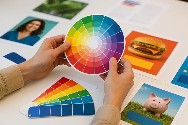
Colours are far more than visual stimuli – they are powerful psychological tools that can influence perceptions, emotions, and ultimately, decisions. In print advertising, where messages must be conveyed instantly, colour becomes one of the most crucial elements in determining the effectiveness of a campaign. Marketers who understand the psychological nuances of colour can leverage it to shape consumer attitudes and drive action.
The Psychological Foundations of Colour Perception
The human brain processes colour before it even interprets text or shape. This makes colour a primal cue in communication. Studies have shown that up to 90% of snap judgments about products can be based on colour alone, depending on the product. Colour triggers emotional responses rooted in cultural associations, personal experiences, and even biological conditioning, making it a strategic asset in marketing.
In print advertising, colours are used to evoke specific emotions and associations. For instance, red is often used to signal urgency or stimulate appetite, which is why it is common in fast food branding. Blue conveys trust and calmness, making it a favourite among financial institutions and healthcare brands. These associations can be strategically employed to influence the reader’s first impression and emotional response.
Moreover, the cultural context cannot be overlooked. In Western cultures, white often symbolises purity, while in some Eastern cultures it is associated with mourning. Advertisers must consider these nuances when targeting international markets, ensuring their colour choices align with the psychological and cultural expectations of the target demographic.
How Colour Affects Attention and Memory
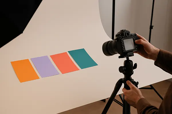
Colour plays a direct role in grabbing attention and improving recall. Warm colours like red and yellow tend to stand out, drawing the eye and creating a sense of excitement. Cool colours such as blue and green, on the other hand, are more soothing and are better suited for messages requiring reflection or trust.
Print ads often use contrasting colour schemes to highlight calls to action or key product benefits. High contrast between text and background improves readability and helps embed the message in the reader’s memory. Research supports that ads in colour are read up to 42% more than the same ads in black and white.
Consistency in colour usage across branding helps strengthen brand identity and fosters recognition. When a consumer repeatedly sees a brand using the same colour palette, it enhances recall and creates an emotional connection, increasing the likelihood of future engagement or purchase.
Strategic Use of Colour in Targeted Campaigns
Different demographics respond differently to colours. For example, younger audiences are generally drawn to vibrant, saturated colours that reflect energy and innovation, while older consumers may prefer softer, more classic tones that suggest reliability and heritage. Gender also influences preferences, with studies indicating that men favour blue and green, whereas women show more affinity towards purple and red.
Marketers can tailor print campaigns based on these insights. A product targeted at environmentally conscious consumers might use green tones to signify sustainability. In contrast, luxury goods often employ black or gold to evoke sophistication and exclusivity. These decisions must be data-driven to align brand personality with consumer expectations.
Brands also use seasonal colour psychology to align campaigns with holidays or times of the year. For instance, warm hues dominate autumnal campaigns, while bright pastels appear in spring advertisements. This seasonal alignment reinforces relevance and creates emotional resonance, leading to higher engagement rates.
Case Studies in Colour Effectiveness
One notable example is Coca-Cola’s long-standing use of red. This choice evokes excitement, passion, and energy—attributes the brand wants consumers to associate with its product. Combined with bold typography and minimalistic design, the red instantly grabs attention and is recognised worldwide.
Another effective use of colour can be seen in National Geographic’s iconic yellow border. It signals exploration, knowledge, and curiosity—core values of the brand. This consistent colour cue has become synonymous with trustworthy, in-depth reporting and is instantly identifiable even without text.
Conversely, poor use of colour can dilute brand identity or confuse consumers. For instance, inconsistent colour use across campaigns may create dissonance or suggest a lack of professionalism. Therefore, maintaining a cohesive colour strategy is essential for long-term brand equity.
Best Practices and Current Trends in Colour Application
Modern print advertising embraces colour not just aesthetically but also functionally. As print technology advances, advertisers can experiment with metallic inks, neon colours, and textured printing to enhance sensory appeal. However, the psychological impact remains at the core of every successful campaign.
One emerging trend is the use of inclusive colour palettes that reflect diversity and social awareness. Brands are increasingly conscious of representing varied skin tones, cultural backgrounds, and preferences, using colour as a subtle tool for inclusivity and representation.
Minimalism is also influencing colour use, with more brands opting for monochromatic schemes or limited palettes to focus attention on the message. Strategic colour restraint can suggest elegance and clarity, which resonates with consumers in search of authenticity and simplicity in advertising.
How to Apply Colour Psychology in Your Own Campaigns
To effectively use colour in print advertising, marketers must begin with a clear understanding of their brand’s core values and the emotions they want to evoke. Choosing a primary palette that aligns with these values helps maintain consistency across all touchpoints.
Conducting A/B tests with different colour variations in print ads can reveal what resonates most with the target audience. Metrics like response rate, time spent viewing the ad, and emotional feedback can offer valuable insights for refining colour strategy.
Finally, collaboration between designers, psychologists, and marketing teams is vital. Colour psychology is not just a design decision – it’s a marketing strategy rooted in human behaviour. When used thoughtfully, it has the power to shape perception, guide decisions, and elevate brand impact in print media.